Could This Be The Future Design Of Bezel-Less Smartphones?
Smartphones are slowly but surely moving towards a completely bezel-less era. With every passing generation, the smartphones become sleeker. We even have a screen-embedded fingerprint sensor now, for people who want a bezel-less design but, also a front-facing fingerprint sensor. But, are bezels just an unnecessary extension or do they hold any importance?
With the technology we possess right now, bezels are important. As much as we would like an all-screen no-bezel phone, it seems highly impractical as of now. Apart from a display, the front of the device also houses a camera, sensors and the earpiece as well. Right now, there isn’t a commercialised technology that can house all of this under a display.
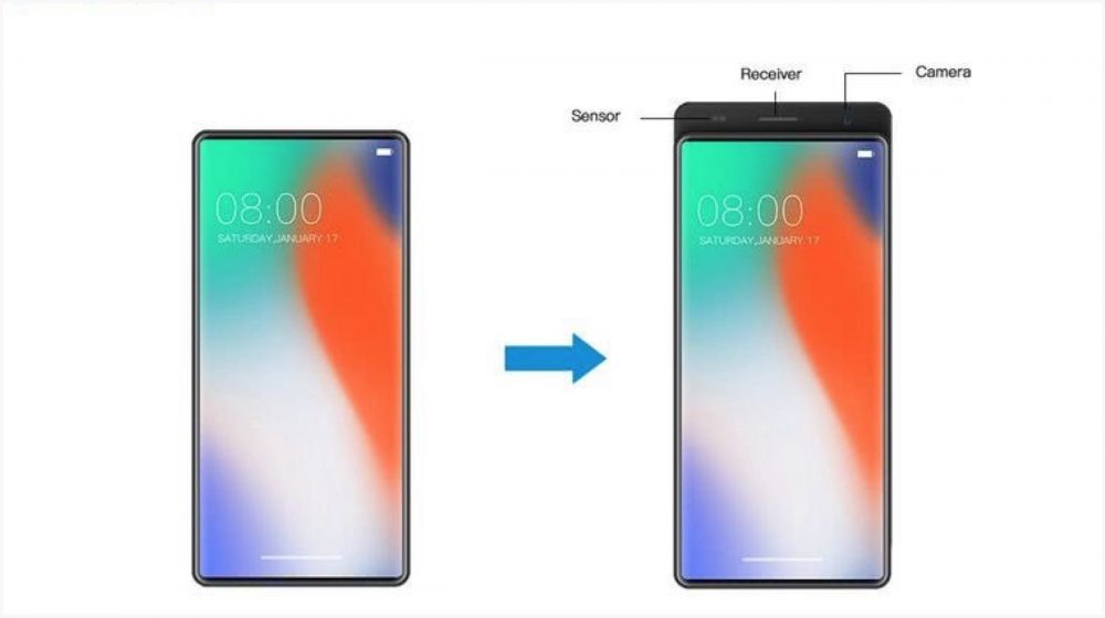
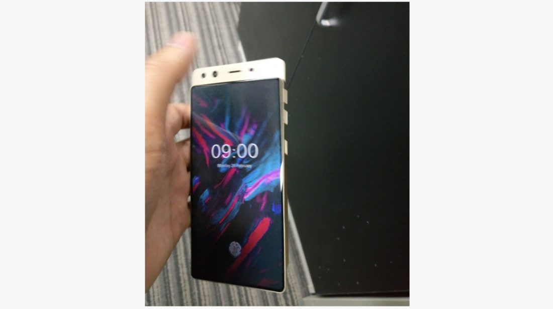
A leak of a new smartphone by Doogee, however, could be the ultimate design solution for companies striving for an all-screen phone. The images of the devices were uploaded to Twitter by a popular tipster and reveal a sliding back panel which really looks ingenious. Basically, the front of the phone is almost all-screen and the front-facing camera and earpiece are housed in a sliding back panel.
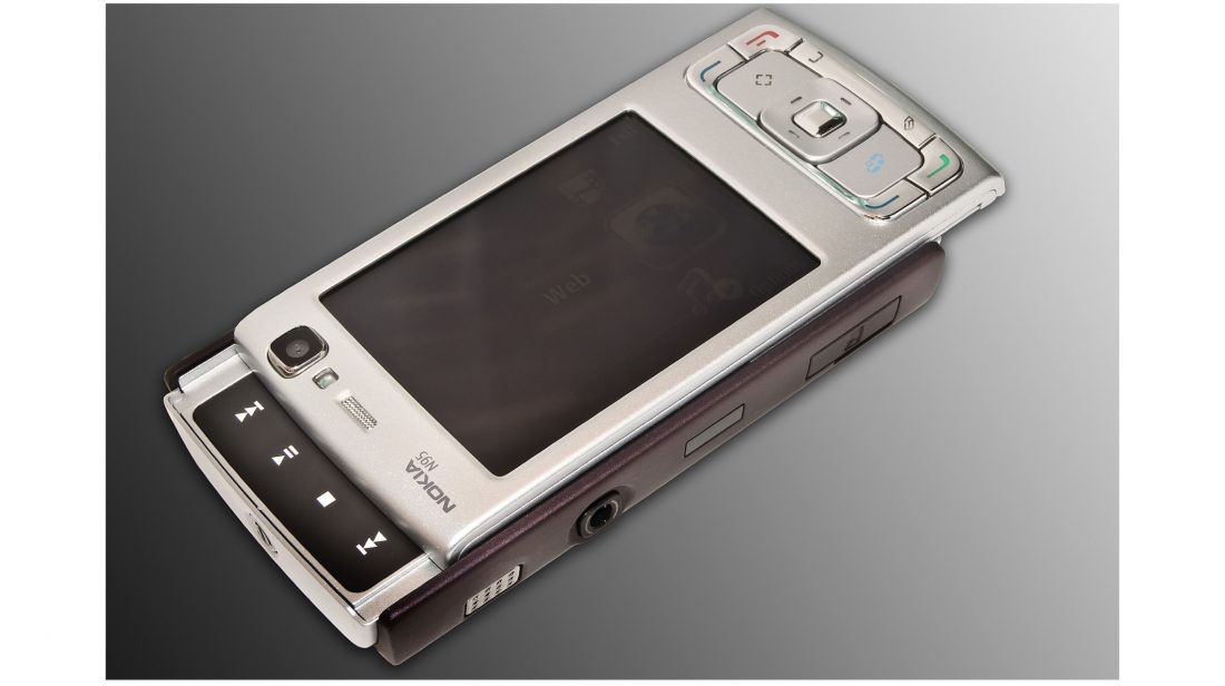
If you jog your memory a bit and go back to 2007, you will recall a certain Nokia phone. The Nokia N95 had a two-way slider where it slid from top to reveal the “music keys.” In a similar way, the Doogee Mix 3 slides down from top to reveal a camera and the earpiece. This means that a smartphone maker can fit a display without worrying about the front-facing camera and earpiece.
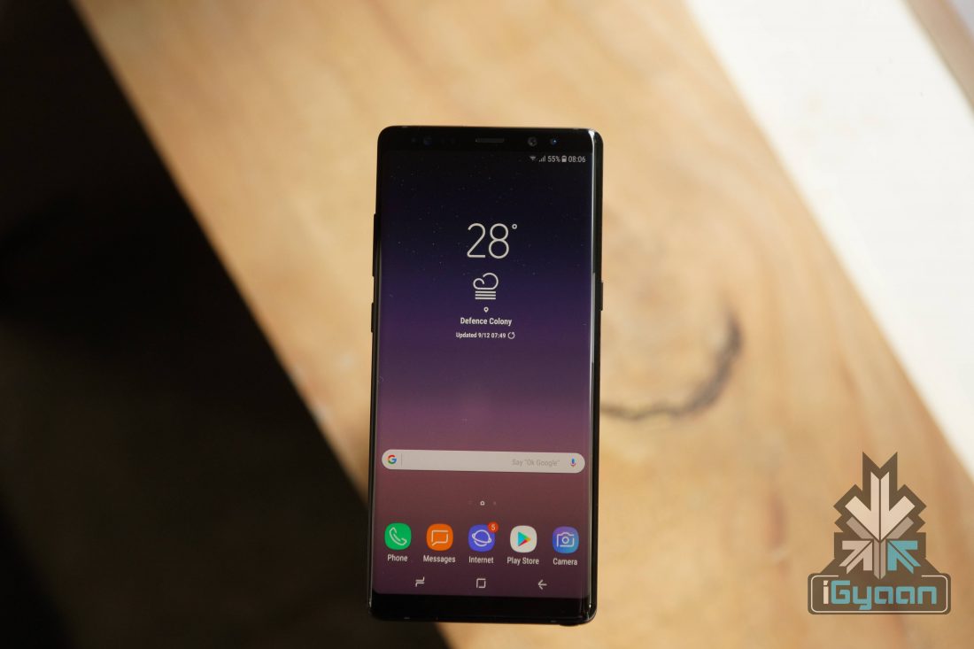
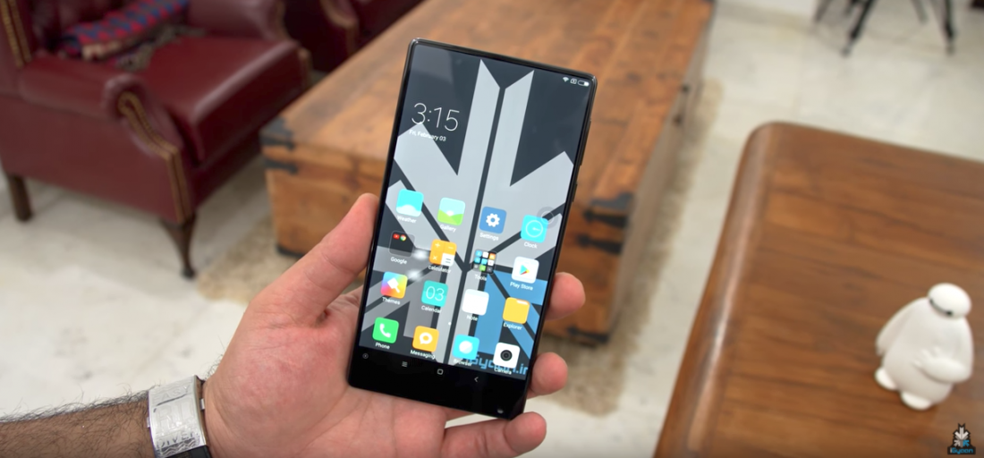
Samsung recently patented a camera that can be housed inside the display but, as of now, it is nothing more than a patent. Samsung decided to go the “infinity display” route with its 2017 flagship phones. It eliminated the side bezels with an edge display and kept the symmetrical top and bottom bezels. The Xiaomi Mi Mix, launched in 2016 had a tri-bezel less design with the bottom bezel housing the camera.
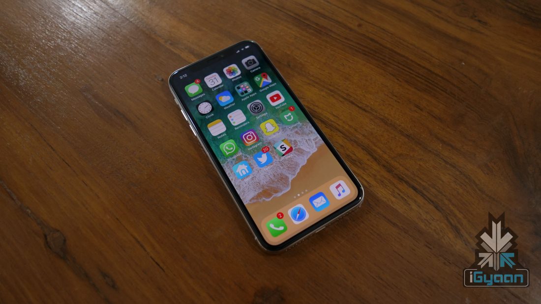
The Apple iPhone X launched in September with a design completely different than any of its predecessors. It looked more modern with a glass back and extremely thin bezels all around the display. Apple took the call to get rid of Touch ID altogether and introduced Face ID. But, the most noticeable aspect of the iPhone X was the notch on the display.
A case can be made whether having a notch on the display is the way forward. People’s despise towards the iPhone X could also be attributed to consumer’s lack of experience with such anomaly. If more smartphone makers adopt the idea, it will expose consumers to more implementations of the notch. Apart from the Essential-Ph1, no other major smartphone maker decided to implement the notch, which meant that the iPhone X was the only smartphone in the market with a design different than what’s “normal.”
However, the notch on the display might hinder in some people’s experience. The old school slider, however, could be a convenient solution for smartphone makers and consumers alike. Until the “camera under the display” technology is commercialised, this seems like the best bet for companies to achieve the goal of an all-screen no bezel design.















 ! For i