Here’s What Android Lollipop Looks Like on HTC One M8
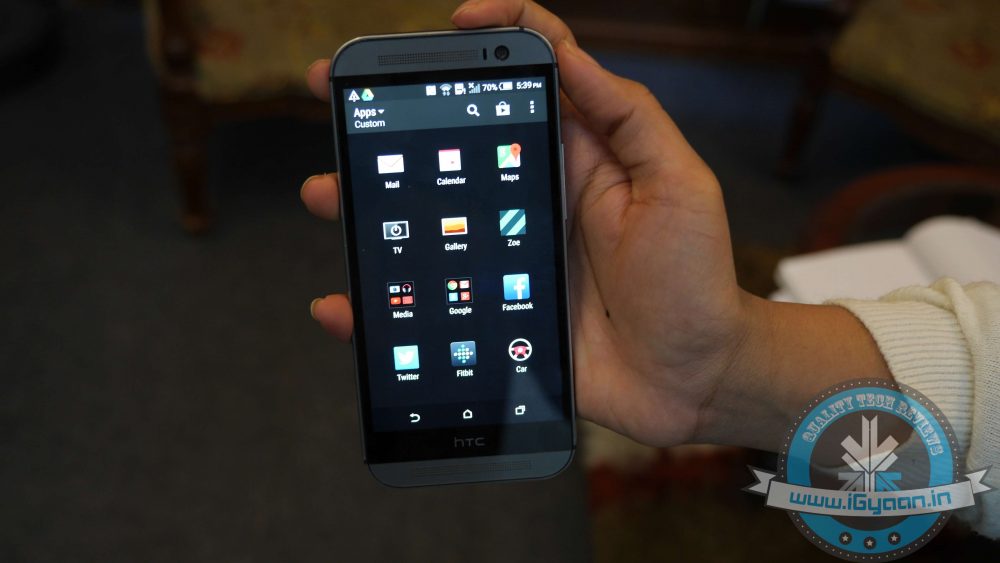
HTC One (M8) owners can now rejoice as the Lollipop version of HTC’s Sense is rolling out. The roll out began today (28th January) and is likely to hit the majority of One (M8) users in the following days. We were lucky enough to get the update on our HTC device.
Weighing in at the hefty 780MB, the update will probably hit your device in the following hours. Among its more notable new features is the revamped notification drawer/quick toggle settings and the recent tasks switcher, which have been inspired by the Material Design guidelines
The majority of improvements make the UI more fluid and snappier than ever before. We are listing top changes in UI of HTC One (M8) with the Lollipop update.
1. Lock screen
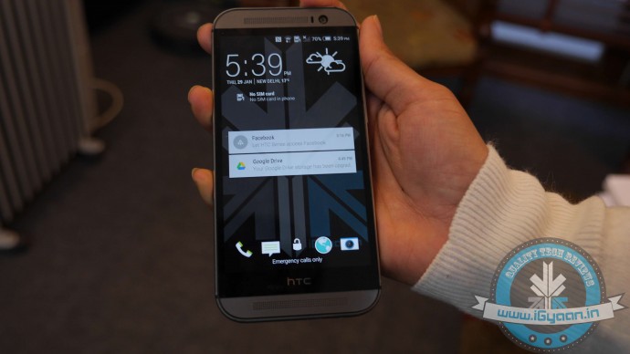
First and foremost, your lockscreen is going to look more sleeker and polished with the Material Design-inspired UI. Just like in stock Android, swiping dismisses the notification and double-tapping it opens the corresponding app. Apart from the slightly dimmed lock screen wallpaper at the bottom, you are also treated to an estimate of how long it will approximately take before your phone’s battery gets drained. The lock screen shortcuts at the bottom are untouched.
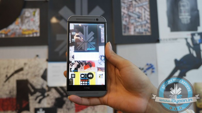
2. New Camera Features and Weather app
The new update adds some camera features such as the Auto Selfie mode, along with some Zoey features as well. The HTC weather app has been removed and replaced with the AccuWeather app.
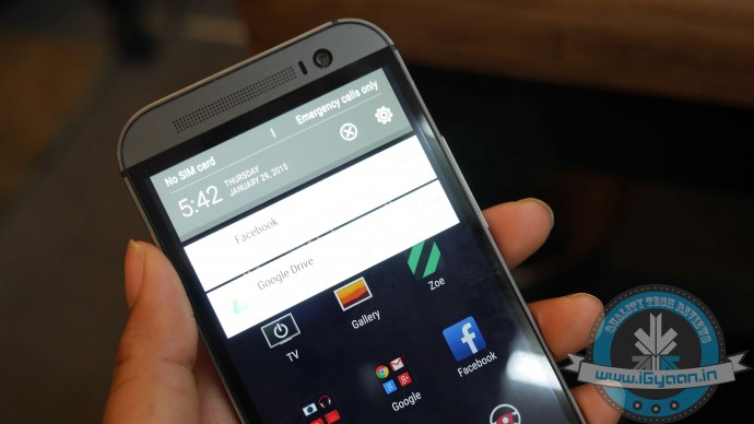
3. Notification drawer
The Lollipop update of Sense 6.0 has adopted a revamped stock Android notification centre. The One (M8) drops the separate side-by-side screens (one for your notifications and the other one housing your quick toggles) and now comes with a slightly revamped Lollipop drawer. A single swipe brings down your notifications, while an additional one reveals the quick toggles shade, which has got a prominent Material Design makeover.
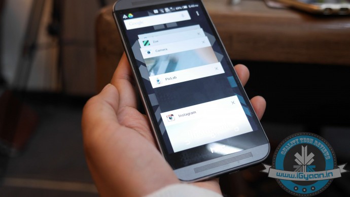
4. Recent App Switcher and Menu
The app switcher has undergone the most drastic change. Instead of the more classic, Sense UI-like grid menu with your recent apps, you will get the carousel-like menu inspired by the Material Design guidelines.
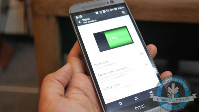
5. Settings and Battery Menu
The setting menu is untouched but with one very important addition – a search button in the upper right corner of Sense UI’s Settings. This probably may go unnoticed but adds the ease to search things in the Settings menu. Another noteworthy improvement can be found in the battery consumption menu of the Lollipop-based Sense UI. It’s pretty similar to the one in stock Android. It now provides you with a more in-depth breakdown of your battery usage. Apart from this, the Running Apps menu hidden in Settings has also been improved. It now displays a much more user-friendly breakdown of the current state of your 2GB of RAM, separating the system from the user-installed apps.

