Google Play Store 4.9.13 with Material Design Comes To Your Phone
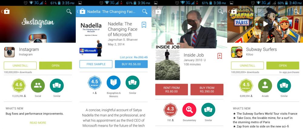
We saw material design at Google I/O and it was impressive with its minimalistic and clean user interface. Now Play Store Version 4.9.13 has been rolled out by Google and it has got the material makeover.
The new Play Store gets a visual makeover and this one does look more appealing. The app view especially looks much cleaner and better organized than its predecessors. The books, album and movie listing pages are much easier to move around in.
The material design elements, with drop shadows, add dimensional features to the interface which is fun to move around in. There is a lot of moving around that needs to be done as the bigger cover designs introduced by this update so that’s a tiny downer. Though the new animations and introduction of a lot more color, covers up that flaw.
Overall, this is a great new update from Google and we can’t wait for material design to now come to our phone and the entire Google ecosystem.
Our latest update is rolling out right now! We’re excited to share a sneak peek of what you’ll get in the coming days pic.twitter.com/k5BidxR4Vu
— Google Play (@GooglePlay) July 23, 2014

