Flickr Previews New Design for Photo Pages
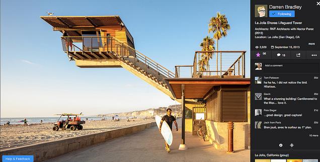
Flickr has rolled out previews for its new design of photo pages, which makes your image appear bigger. With the new look, a 25-percent larger picture fills the left side of a page, while its description, comments, meta information and more take rest on a right-hand side.
Yahoo has also made other changes like, promising a speed boost while loading the next image, which can now be done by clicking the current photo. Marissa Mayer and Co. say that this is an early version of the revamp, however, and that not all features have been included. To preview the fresh layout, just navigate to a photo and hit the “Try Our New Photo Experience” button, and you will be able to enjoy the new preview.

