Jony Ive’s iOS 7 To Be “Black, White And Flat All Over”

Apple’s new iOS 7 will be unveiled at the upcoming WWDC on June 10th. Rumours are that the OS will receive a complete “software overhaul” and scrap the “realistic images” in favour of a “flat” design. 9to5Mac, who’s been incredibly reliable over the years, has written an in-depth piece from insider sources about the upcoming features within iOS 7.
The site reports that the OS will come with a few new features, but mostly sport design enhancements that will see it be “black, white, and flat all over.” Apparently Jony Ive, Apple’s SVP of Industrial Design, wanted to shed the “texture-heavy” iOS of past years (designed by Steve Jobs and former iOS chief Scott Forstall) by making “his mark on every corner of the operating system.”
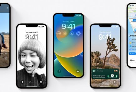
Some other notable takeaways are that the lock screen will “drop the shiny, transparent time bar on the top of the Lock screen in exchange for a shine-free, black interface. Additionally, the square-grid for entering a pin code has been replaced with round, black buttons with white text and white borders.” In addition, the drop down notifications will be changed to a dark grey/black colour with white text.
As 9to5Mac reports, in software design meetings with Apple’s iOS designers, accompanied by Apple’s Human Interface vice president Greg Christie, Ive has shared his reasoning behind his distaste for the texture-heavy (skeuomorphic) interfaces heralded by Apple co-founder Steve Jobs and former iOS chief Scott Forstall.
Ive stated that software designs filled with physical metaphors do not stand the test of time, according to a person familiar with the design meetings.
According to the report.
The iPhone’s Notes app has replaced the yellow notepad design for a flat white look. Apps such as Mail, Calendar, and Maps have also gained a more uniformed look with flat white textures.
While the core elements of those apps are mostly white, each app has been given a unique button color. Essentially, each app has a white base with a respective color theme.
For example, the Calendar app could potentially have red buttons, while Messages could have green controls.
Apple is apparently also testing new panels/widgets that could see easy access to WiFi, Airplane Mode, and Bluetooth (like on Android).
[9to5Mac]

