Microsoft Debuts New Logo Before Windows 8
In advance of the Windows 8 launch on Oct. 26, Microsoft today unveiled a new logo that’s 25 years in the making.
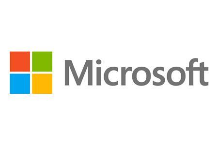
The world’s largest software company is introducing a dash of color in its first logo redesign since 1987, using a new multi-colored square next to a plain rendering of its name, replacing its well-worn italic style logo.
Microsoft is rolling out its new Windows 8 operating system along with new Office and phone software this autumn, and is hoping the new logo unifies customers’ experience of the company, much like rival Apple Inc’s distinctive logo has for its consumers.
The logo uses the so-called Segoe font, which is used in Microsoft products and marketing materials, and four colored squares that are “intended to express the company’s diverse portfolio of products,” the Redmond, Washington-based company said on its blog.
“It’s been 25 years since we’ve updated the Microsoft logo and now is the perfect time for a change,” said Jeff Hansen, general manager of Microsoft’s brand strategy, in a blog on Microsoft’s website. “This wave of new releases is not only a reimagining of our most popular products, but also represents a new era for Microsoft, so our logo should evolve to visually accentuate this new beginning.”
The new design, which resembles the existing logo for Windows, its most important product, is already in use on Microsoft’s website and is being unveiled at its latest store opening in Boston on Thursday.


