Twitter Updated With Pleasing Colour Schemes And Dark Mode
Twitter is one of the most popular social media platforms. The microblogging website/application is an active service that is provided to its large user base. Similar to Facebook, WhatsApp and Instagram; Twitter too has a refresh cycle in which it upgrades certain aspects related to its service. The social media giant has now announced a refreshed new look for its desktop version of the official website.
https://twitter.com/Twitter/status/1150812293124546561?ref_src=twsrc^tfw|twcamp^tweetembed|twterm^1150812293124546561&ref_url=https%3A%2F%2Fthenextweb.com%2Fapps%2F2019%2F07%2F15%2Ftwitter-launches-its-faster-cleaner-design-including-new-color-themes%2F
Previously, Twitter was rumoured to overhaul its aesthetics which has now finally been unveiled. The social network is live with its new skin today (16th of July) and it seeks to offer a more streamlined experience; it goes in line with its mobile application iteration. For a quick look here are all the notable changes that have been made: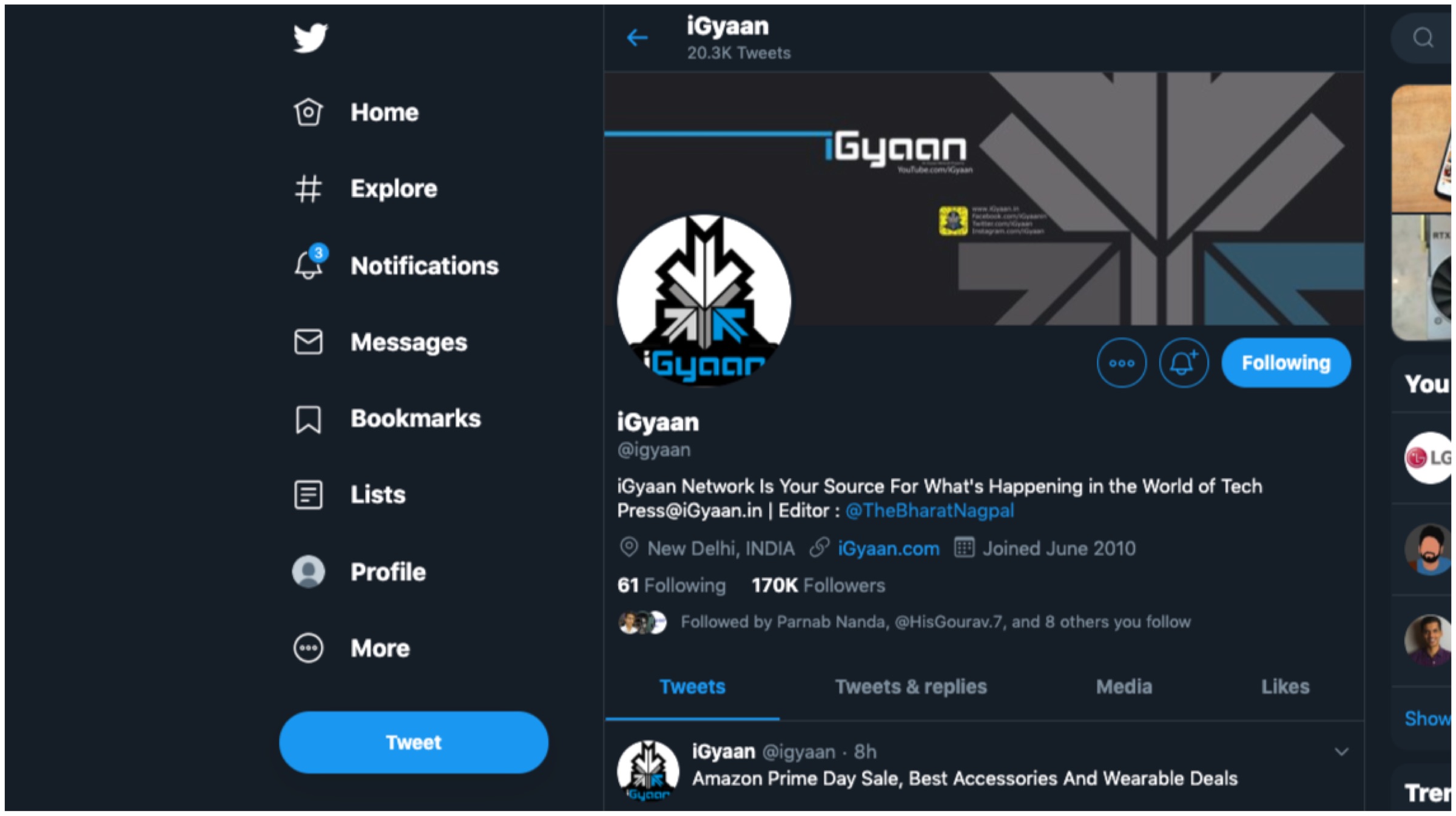
Changelog
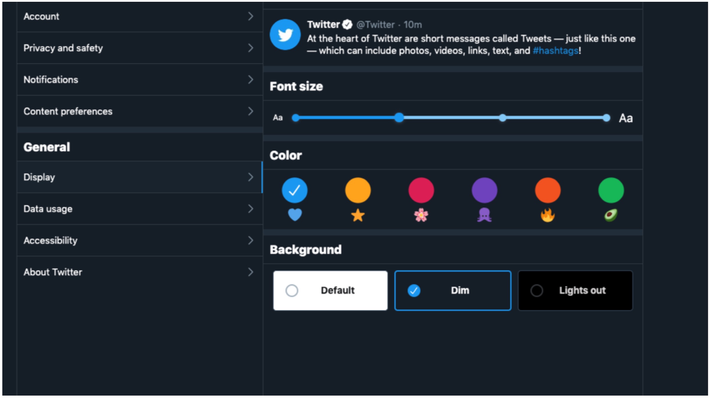
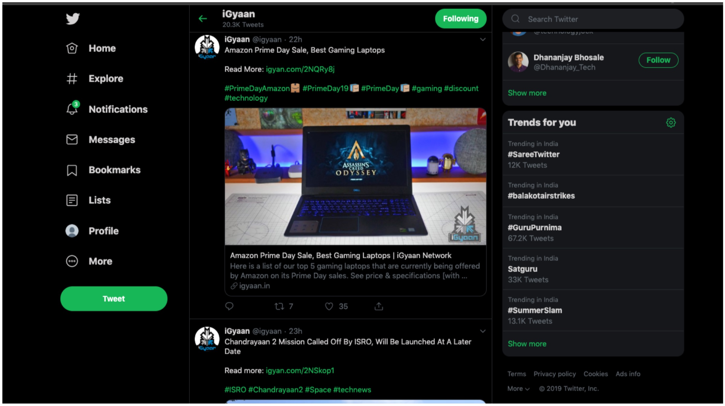
- Users now have two additional options with dark mode alongside various other themes and colour options.
- The ‘Explore’ tab is now available on desktop for easier navigation to find live videos or location based posts on Twitter.
- Direct Messages now offers a larger view which enables users to respond to multiples messages on the same screen.
- It is now much easier to navigate the side menu as Bookmarks, Lists and Profile as they are now found on the left margin.
- The sidebar menu allows for seamless switching between different user accounts.
According to the company, the changes are built upon a major revamp of Twitter’s back end architecture with Twitter.com being remade from scratch. The new changes were made to offer a clean, intuitive and more faster user interface experience to all. It ensures a more efficient platform that have a more unified experience across multiple platforms like PC and smartphones. For example, tablet users are able to use keyboard shortcuts similar to desktop users. Furthermore, the refreshed website will only load features as and when required to save on data on metered connections.
Also Read: Qualcomm Announces Snapdragon 855 Plus SoC For Gaming Smartphones
Twitter has claimed that its has worked on the aforementioned changes with “hundreds of thousands of responses.” The feedback was received during the testing period which paved the way for the final design. The new look is rolling out gradually and will not be available to everyone immediately. For those who wish to acquire the changes, simply click on your avatar and opt to “Try the new Twitter.” The fresh aesthetics will have its fair share of likes and dislikes, but to us it offers a unique and clean interface. Do let us know what you think of the new changes.

















 . Thou

 ! For i