Youtube Homepage gets a makeover, part of the overall design change
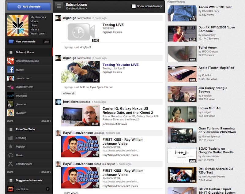
Youtube has today launched a new redesigned version of their homepage. At first the page may not look as interesting as it is, but a closer look will reveal that a large amount of brain power has gone into redesigning one of the most viewed pages on the internet. The revamp splits the homepage into three sections which, in many ways, feels familiar and mirrors the way Facebook operates. On the left, a navigation bar features links to videos shared by your Google+ and Facebook friends, while it also lists each of the channels you subscribe to along with trending and popular uploads.
Youtube has also unleashed new Channels, which make it easier for creators ( like iGyaan) to interact with the viewers. Our new redesigned channel should be up shortly. YouTube says it has also added “a coat of paint” to the whole site, along with the ability to easily customise your own channel.

