Android Popsicle May Be The Final Name Given To Android 9.0
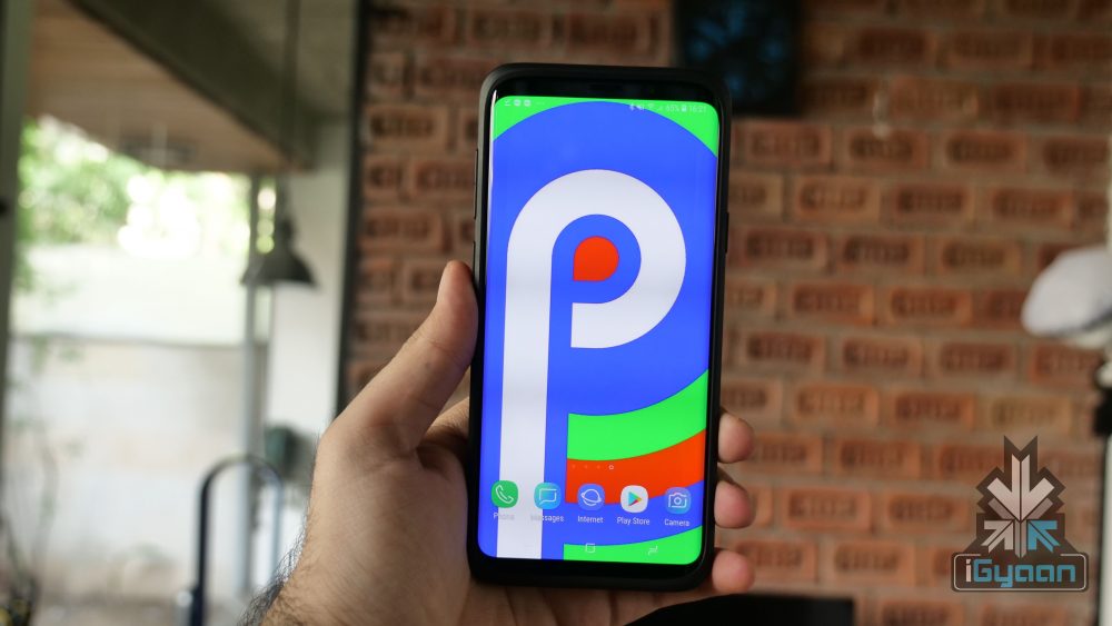
Ever since Android’s inception in 2007, the mobile operating system has an interesting and fun naming pattern. Google has stuck to naming every iteration of Android after a type of dessert. The most recent version, Android 8 goes by the moniker of Oreo. The next in line is Android P which will be unveiled Google I/O 2018 and get an official release in the third quarter of 2018. While many desserts start with the letter P, Google appears to have dropped a major hint about the possible name of Android P and it may be Android Popsicle.
On its official Instagram account, Google released a set of Spring wallpapers with a certain delicacy making an appearance. Of the five wallpapers released by Google, the last image was of different kinds of popsicles. You don’t need to be a rocket scientist to jump to the conclusion that Google might have just very blatantly hinted that the full name of Android P could be Android Popsicle.
Over the years, Google has been known to have a bit of fun with its followers, especially when it comes to the names of new Android versions. Google always leaves subtle hints to mislead its fans into predicting a wrong name for the upcoming version of Android. With this Android Popsicle wallpaper trick, however, Google was anything but subtle. Now, it is completely possible that Google has just trolled its 6.2 million Instagram followers into believing that the next version will be called Android Popsicle.
The first developer’s preview of “Android Popsicle” was released in March 2018 and had a few interesting features. Acknowledging the growing trend of notches, Google introduced the notch feature in the first preview of Android P. Once enabled, the clock moves to the left-hand side of the notch along with notification icons. Other icons like Wi-Fi, Bluetooth remain on the right side of the notch. Interestingly, different sizes of a notch can be emulated.
Visually, other changes include a slight redesign of the notification panel. The icons in the quick settings pulldown have rounded corners now. If activated, the icons will be blue in colour and when inactive, it will turn grey. To access other quick settings toggle, the user has to pull down on the grey bar just underneath the initial menu.

















 ! For i

