Evleaks Nexus 4 Render Shows New Homescreen
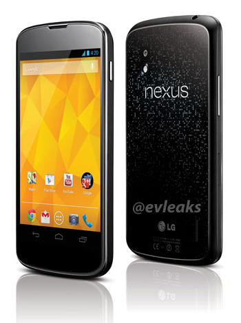
Over the weekend, yet another Nexus 4 leak emerged. This time, @evleaks showed off what is ostensibly going to be the new home screen of Android 4.2. While the overall look remains the same — some think this will still be called Jelly Bean — it shows off something very interesting.
On all other Nexus devices, Google has put four icons on the bottom dock in order of importance. Phone, then Contacts, then Messaging, then Browser. In Android 4.1, the Browser icon became Chrome for Android, but the order was the same. These are icons that stay with you regardless of what home page you’re on; these are the ones you’re likely tapping the most.
If the above render is accurate, Google has changed up this order for the first time since the Nexus One in 2010. On the left-most side now is Chrome, emphasizing the fantastic browsing abilities of the new device. Then we have Gmail, which was previously relegated to the Google folder. After that, another new icon in the dock: Camera. While the Galaxy Nexus didn’t have a great camera sensor, Google reworked the camera UI to make taking photos much enjoyable.
Lastly, we see the Phone icon, which still remains an important part of the show, but less so than ever. Judging from the informal surveys I’ve taken of smartphone users over the years, voice calls are decreasing in importance as users transition to text-based forms of communication. Data — and therefore browsing — have become paramount in the eyes of the average Android user. Email, too, has maintained its importance, and Android 4.2 is expected to improve the experience dramatically with a new Gmail app.
Now, this render could be totally bunk, or it could be that I’m reading way too much into this. But if it turns out to be true, Google is certainly making a statement about what it thinks is the future of smartphone usage. Or, it could just be a big, fat arbitrary coincidence.












 ! For i

