iGyaan 2.0

After completing 6 years of existence earlier this year, iGyaan was destined for a new direction. Today we roll out iGyaan 2.0, a newer user friendly and more upfront iGyaan.
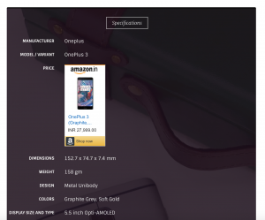
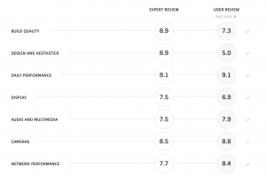
The intention is to bring information to the user, you can now view specifications for products right on the page, in a beautiful and simplified layout. For reviews, you will now be able to not only see Ratings from our editors but also leave your own ratings for products.
Our new Video player can be found in the Videos tab on the Top, and it allows you to watch the latest videos, without ever needing to reload the page. We are also compressing the video for you on our server so that they load faster than usual and you use less data.
- Specs Listing
- User Ratings
- iGyaan Video Player
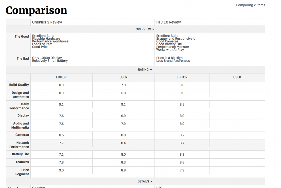
We are also introducing comparisons across product categories, you can simply click the grid box comparison on any product or review and compare it with another product or review, go ahead and compare the OnePlus 3 review with the HTC 10 review for a quick understanding.
While the website is new, and we have fully deployed it, it might take a few days for us to get up to speed, since there is a lot more for us to update, including specifications for a whole host of products and new launches. Stay tuned for announcements, of iGyaan on Youtube 2.0 along with new launches coming in the near future. We hope you like the new website.
If you do run in to issues or have any bugs to report, please do so with the contact button on top of the page.
Now back to technology.


