YouTube – Cosmic Panda Interface Now Available

With the beta test of Google+ we’ve seen an across the board redesign of most of Google’s services. Google search got the black bar on top. Gmail got two new themes for users to try out. Now it’s YouTube’s turn.
Google has announced the availability of the Cosmic Panda Interface for users to test. The interface sports a clean and professional look which gives more emphasis to video space. The interface is designed to be quite dark, which might be an effort by Google to reduce electricity consumption across the world.
The first thing that you notice when you use the new interface is the video. It has been brought to the center of the screen and the clutter around it has been removed. It is very easy to switch video sizes from the buttons at the bottom of the interface. The comments section has been placed under the video in a better interface which makes viewing comments easier.
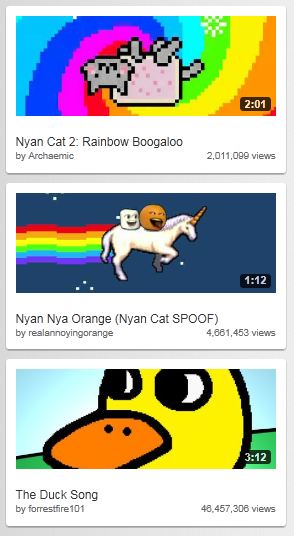
Another feature to note is that Google has increased the size of the related video preview images. This makes it easier to view related videos but the downside is that it requires users to scroll a bit more. One feature we really liked is the redesign of the video player itself. The progress bar has been coloured in such a way that the loaded section is grey and blends into the background. The section that has already been played turns red like the old interface.
The channels interface has gone through an upgrade as well. The video links are now much larger and the latest video player has been removed. Chrome users will benefit from a really cool feature called “Keep Watching” which lets you watch a video and browse a users channel at the same time to queue your next video. The video that is playing gets reduced to a small thumbnail on the top of the screen. You can queue videos and resume watching the currently playing video simply by clicking the thumbnail.
You can test out the new interface and leave your feedback with Google at http://www.youtube.com/cosmicpanda.

