Moto 360 2nd Gen Review
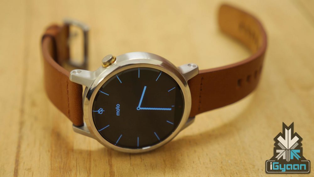
The original Moto 360 was met with a lot of hype, and quite rightly so as it was the device that kicked off the Android Wear trend. While the first iteration was met with a lot of praise, finding a lot of things to love about it and a few faults as well, the second generation Moto 360 builds on its predecessor and improves where it needed to.
Overview
The Moto 360 2nd Gen was unveiled at IFA Berlin last year and was launched in India early September. The smartwatch comes with new design language and customization options including Moto Maker, which, however, is not available in India yet.
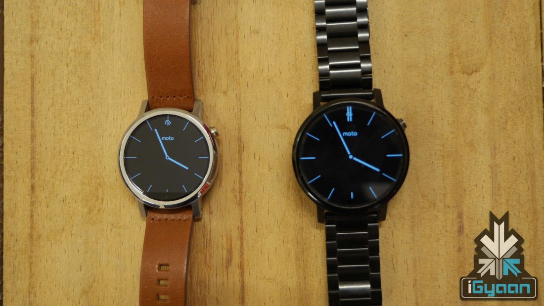
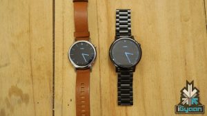
42mm (left), 46mm (right)
The Moto 360 2nd Gen starts at a price of Rs 19,999 for the 42 mm variant and Rs 23, 999 for the 46 mm option. The smartwatch is available on Flipkart and Amazon.
Build Quality and Design
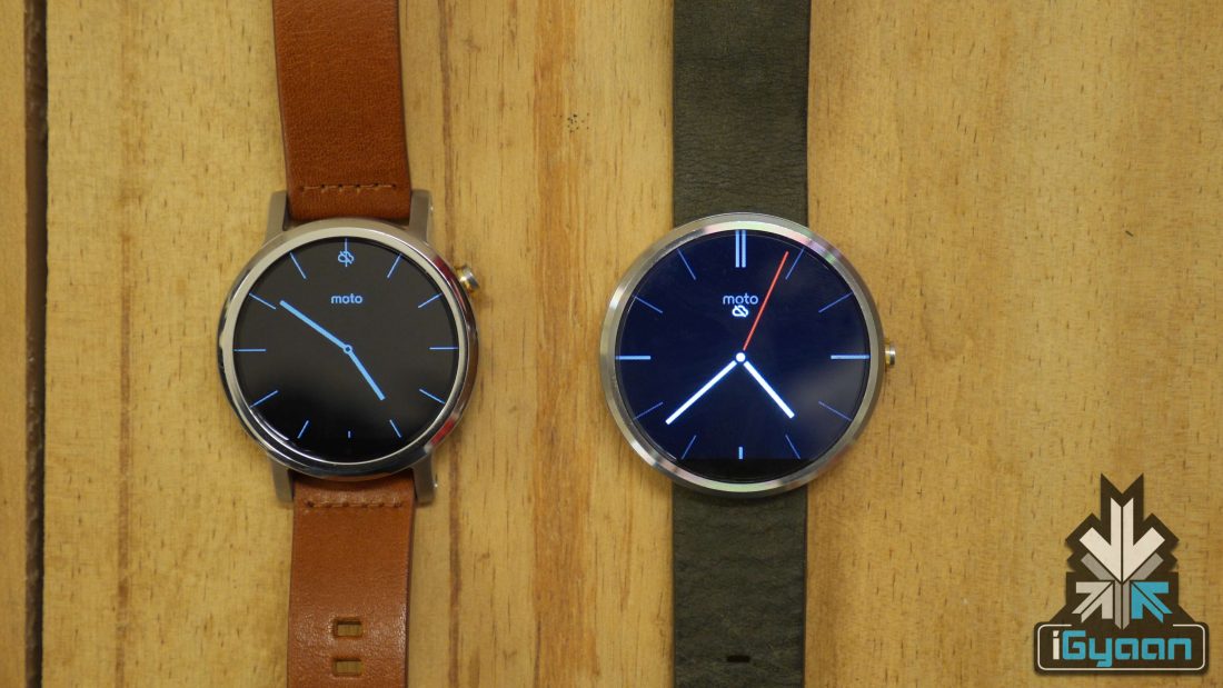
Moto 360 2nd Gen (Left) Moto 360 1st Gen (Right)
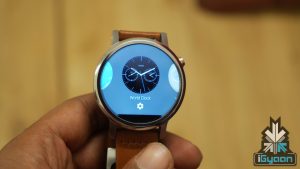
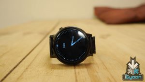
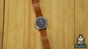
The Moto 360 2nd Gen’s new design language is pretty great. The smooth metallic edge is complemented with thin, refined aluminium bezels. The watch has a firm, strong build and the added nubs give it a better shape and rigidity and gives the device a more watch-like feel to it. The nubs also make changing the straps easier and the lugs are pretty simple to unclasp the band as well. The crown has shifted up a bit to the 2 o’clock position and the top sports the ‘M’ logo.
The Moto 360 2nd Gen is available in three different sizes – a 42 mm male and female version and a male-only 46 mm model. The difference between the male and female version is that the latter attaches itself to a thinner 16 mm strap while the former is compatible with a 20 mm strap only. The 46 mm variant is compatible with a strap that measures up to 22 mm. While the size of the straps differ, the models are all 11.4mm thick, which feels just right without looking too bulky.
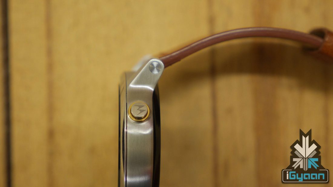
The button moves to the 2 o’clock position
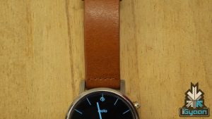
Size isn’t the only point of variation the Moto 360 offers; it comes with a variety of bands to pick from – metal, leather and silicon. However, the silicon version will not be arriving in India any time soon. The smartwatch also comes with gold, rose gold and silver cases and bands. The leather on the 42 mm variant looks elegant on both men and women, while a metallic strap for the 46 mm model looks great on larger wrists.
Display
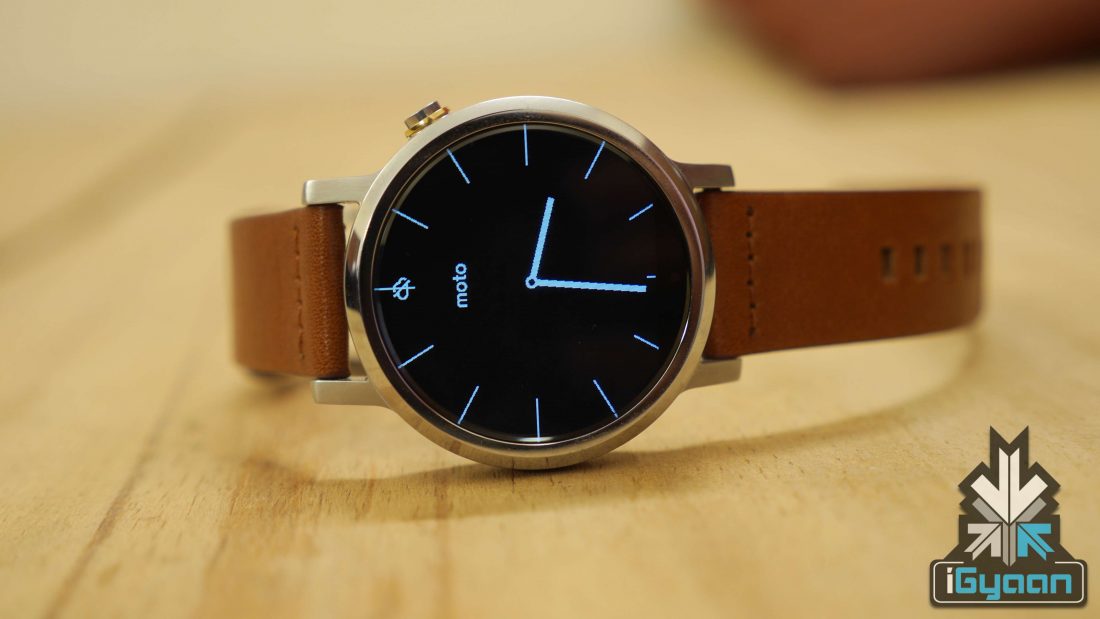
The 42 mm and 46 mm variants have a 1.37 inch and 1.56 inch LCD display, respectively, and both come with Gorilla Glass 3 protection. The 46 mm version comes with a 360 x 360 pixel resolution and 233ppi, while the 42 mm version has a display resolution of 360 x 325 and 263ppi.
The Moto 360 has received a lot of polarising opinions regarding the display. The popular opinion of it being the first round smartwatch without actually having a fully rounded display stays with the 2nd Gen as well. This is because the screen has a flat-tire like band on the bottom that houses the sensors.
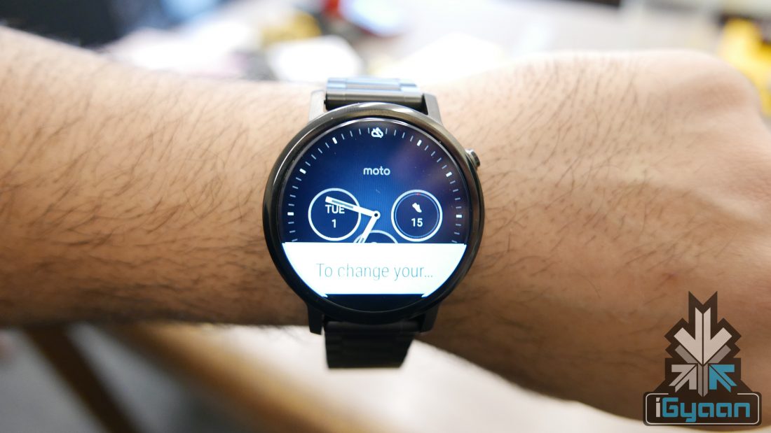
Though many felt the band a little distracting, Motorola has decided to stick with it, and it has come to become something of a defining trait for a Moto smartwatch. After a while with the Moto 360, you tend to grow used to the little band and it really doesn’t feel like an issue. The band also allows Motorola to keep the bezels thin, which is what adds to the look of the device.
The display is quite bright but the LCD screen lacks the vibrancy of an AMOLED display. The light sensor which helps to dim and brighten the screen allows just the right amount of brightness under both light and dark conditions without hurting the eyes. Outdoor visibility is questionable. There’s a ot of glare on the display under sunlight, but you’ll be able to see it just fine when facing the watch directly to yourself.
Hardware and Performance
The Moto 360 Gen 2 is powered by a quad-core Qualcomm Snapdragon 400 processor, an Adreno 305 GPU and comes with a 512 MB of RAM space with a 4GB internal storage on board. Connectivity options include Bluetooth and Wi-Fi. The watch also supports a GPS connectivity, however, it only comes with the Sport range (which unfortunately isn’t available in India yet).
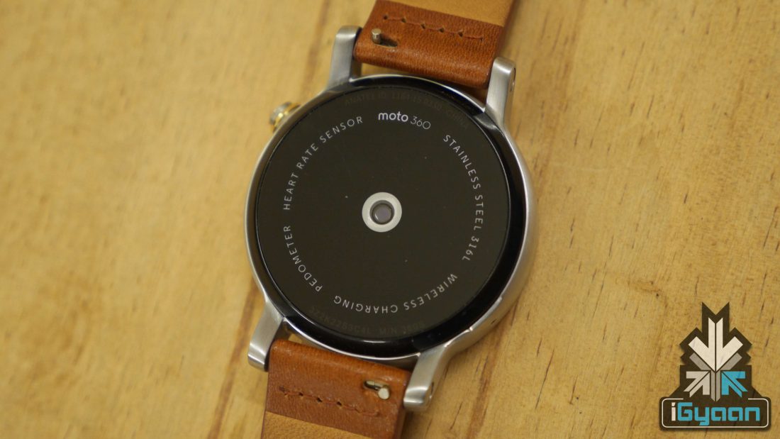
One of the concerns people had with the first iteration was that the device came with a slower OMAP 3 chip, but the second generation rocks a quad-core SD400 processor, and needless to say, there are some differences when using the device. The interface on the 2nd Gen is a lot snappier with very little lag.
Specs |
Moto 360 2nd Gen |
| Display | Men and Women 42mm: 1.37-inch 263ppi (360×325)
Men 46mm: 1.56-inch 233ppi (360×330) Corning Gorilla Glass 3, backlit LCD |
| Watch Case Dimensions | Mens: 46mm diameter by 11.4mm high 42mm diameter by 11.4mm highWomens: 42mm diameter by 11.4mm high |
| Processor | Qualcomm Snapdragon 400 with 1.2 GHz quad-core CPU (APQ 8026) Adreno 305 with 450MHz GPU |
| Sensor | Accelerometer, Ambient Light Sensor, Gyroscope, Vibration/Haptics engine |
| Memory | 4GB internal storage + 512MB RAM |
| Connectivity | Bluetooth® 4.0 Low Energy Wi-Fi 802.11 b/g |
Performance of the Moto 360 2nd Gen is pretty smooth, however, it isn’t the smoothest smartwatch out there. The Moto 360 falls just short of the Apple Watch and Samsung’s Gear S2, but given the price of the Moto 360, we can’t be greedy.
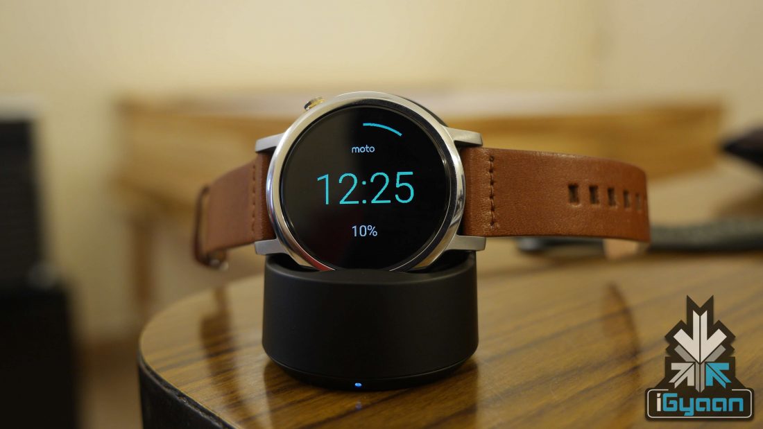
Battery life is good too and an improvement over the first Moto 360, but that’s not saying too much. One of the main problems with smartwatches has been the battery, or the lack therof. Luckily, the Wi-Fi feature helps conserve battery life just a little more.
With the Ambient Mode that leaves the display on and dim continuously turned on, the smartwatch lasts a full day. Consequently, with the Ambient Mode turned off, the smartwatch can go on for a day and a half (for the 42mm 300mAh variant) on a single charge. The wireless charging is zippy too, powering up the Moto 360 to about 50% in under an hour.
- 42mm: 300mAh – Up to 36 hours of use with Ambient Mode off and up to 9 hours with Ambient Mode on (both on basic daily usage)
- 46mm: 400mAh – Close to 2 days with Ambient Mode off and 11 hours with Ambient Mode on (both on basic daily usage)
Features
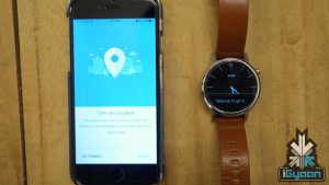
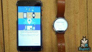
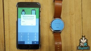
The new Moto 360 is compatible with Android devices as well as iOS due to Android Wear’s move into the Apple Store. This gives the Moto 360 an edge over the Apple Watch as the latter is pricier and works only with iOS. The pairing with iOS is pretty seamless and the watch displays your phone’s or tablet’s notification and messages to which you can voice reply. You need only download the Android Wear app on your iOS device and reset your Moto 360 to begin pairing.
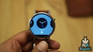
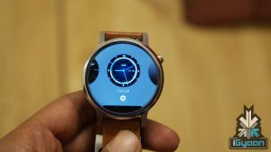
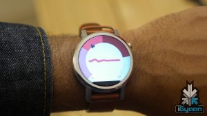
The Moto 360 has a unique feature called Live Dial, which allows its users to set dials on their home screens. Other than a bunch of options provided by Motorola, users can also use their own pictures as the watch-face. There are a number of dials available and you can use your paired smartphone or tablet (including iOS) to set the faces for your watch.
The smartwatch also supports the Moto Body software, that keeps a tab on calories burnt and bpm stats with the help of an optical heart rate monitor. It is packed in with a 400 mAh and 300 mAh battery for the 46mm and 42mm versions respectively. Both variants will come with a charging dock station.
Additionally, the watch is rated at IP67 which means it can be soaked in 1 m (3.3 ft) of water for half an hour. With a leather strap, however, we stress caution and would advise keeping the smartwatch away from water at all costs.
Conclusion
The Moto 360 2nd Gen is a great Android Wear device and a starting price of Rs 19,999 keeps it in the affordable range. The fact that it is iOS compatible makes the watch a strong competitor for the pricier Apple Watch. Changing the straps is easier and the display is sharper. However, there are some cheaper smartwatches out there like the Asus Zenwatch 2, which comes with an AMOLED display and Sony Smartwatch 3. But for those who want a smartwatch that looks like a watch, then the Moto 360 2nd Gen is worth spending a few extra bucks on. indeed, it is the most elegant looking rounded smartwatch currently in the market.
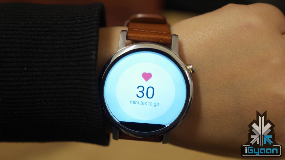
The Moto 360 2nd Gen does feel more like a watch this time around with a solid build thanks to the added nubs, and the customization options here are quite extensive. Furthermore, the upgraded processor makes the Moto 360 pretty snappy to work with. There aren’t too many noteworthy apps here but there’s enough to make it smartwatch-worthy. The design is a big win and it is worth considering just for that. Another noteworthy point is that the Wi-Fi option here will help conserve battery life and you won’t have to leave Bluetooth on all day.
- Moto 360 2nd Gen

