Google Reinvents Google+ With Focus On Collections and Communities
Google’s attempt at creating a social networking website sort of died down after the launch of Google+. It did not seem to get the attention it was looking for and seemed dormant for the longest time. However, Bradley Horowitz, the VP of Photos and Streams at Google and Luke Wroblewski, Product Director at Google; seemed to have re-worked and re-designed the app.
Some features like the Photos and backing up on YouTube have been highlighted. the main purpose was not to remove or eliminate features but to highlight the features that worked for Google+ and streamline the ones that didn’t.
“Photos wasn’t the only product with opportunity. We asked ourselves “how can we make this better and serve more people?” said Bradley Horowitz
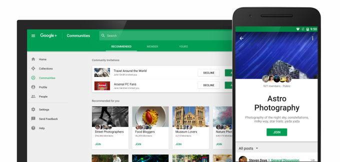
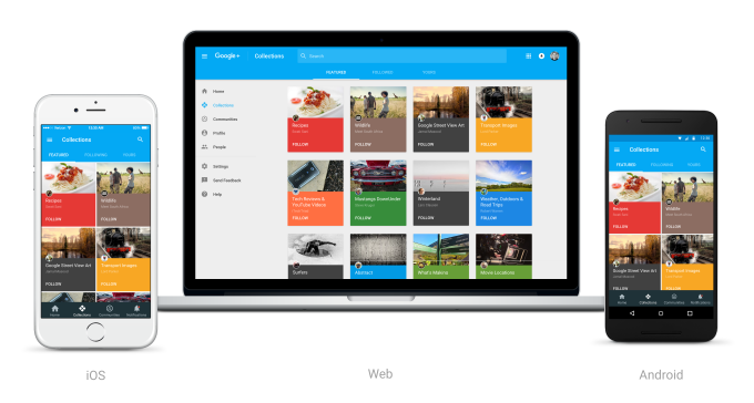
A lot of work seems to have been done in researching user needs, designing and archiving data to revamp Google+. The result of this is the new G+ with a focus on Communities and Collection. While, Communities was launched in 2012 in order to reduce the need for discussion groups; Collections is rather recent Pinterest-type feature, that was introduced only earlier this year.
However, after going on a road trip in order to survey the needs and difficulties of hard core Google+ users, the designers have come to the conclusion that these were the two main features that required to be highlighted. Their main aim was to make their pros stand out, and try their best to hide the cons while working on them.
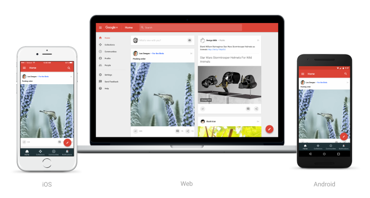
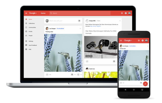
The new version also caters to a mobile first experience which was previously not one of the top most priorities for Google+. Therefore, the web design has been made much more responsive, and along with that, the iOS app has been fully rebuilt and redesigned. The Android version on the other hand will now cater to what people are using while pushing aside the unused features. Moreover, the new G+ runs on Material Design, which is a language developed by Android itself.
The new design is being compared to Facebook or other social networking site’s layouts. However, that is not entirely a bad thing, although it does look like they are still relying on their user base to fill their home pages with more interesting things. Google will now fill up your homepage with things that it thinks you are interested in, based on the content you surf and share.
One of the main realizations that they had was the fact that Google+ had too many features that were all over the place. So as Horowitz says they had to reinvent within the current framework. So, to conclude we can safely say that Google has focused on what worked for them by enhancing the presence of ad-friendly groups, adding a streaming focused feature, and reaching out to their users via the web, iOS and Android.


