Twitter Revamps its Homepage to Lure New Users

Only yesterday Twitter hinted that a new and friendlier user interface is on its way, and today, Twitter has confirmed the news is true. The social networking service has rolled out the new web interface in US today, providing a new experience to its users.
The official blog post of Twitter reads –
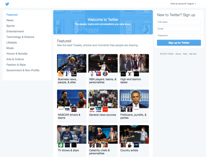
Starting today, when you go to the twitter.com homepage, you’ll find interesting topics to explore like Politics, Pop Artists and even Cute Animals. Click on the topic and you’ll see a timeline of Tweets from some of the most popular accounts in that topic. It’s rich real-time content, just like the Twitter experience for users who log in.
Twitter states the new homepage will be made accessible to other regions as well in due time. The page for signed-out users displays three columns with a header that welcomes the users and invites them to see ‘What is happening right now.’
The left column includes categories like News, Sports, Entertainment, Science and Technology, etc. which is divided into more sub-groups. The middle column shows thumbnails with titles like ‘Business News, people and sites’, ‘Country Artists’, etc. These clickable thumbnails take users to another login page that shows highlights of that particular section. The right column is kept for Login or Sign Up.
Right now, users can directly check out tweets without logging 0nto Twitter. The company said an approximate of 200 million people visit profiles without signing in. Hence, if they manage to convert even a small percentage of the visitors into active users, the company will grow significantly.


